Some of my favorite are the Dodge Ram Truck ads last year that used an old type setting/offset theme. I can't find any examples, but if you are like me you have probably see them around.
This is a basic tutorial on how to take plain old image gallery pictures to another level and make them interesting. I had some down time and in a few hours boosted our vehicle wrap image gallery. There are plenty of mistakes and room for improvement, but I was limited with time. Case in point is ZR Graphics.com, which is the website for a large format printer in Zeeland Michigan who designs, prints and installs vehicle wraps on a variety vehicles.
This is not a full, step by step TUT, so sorry if it doesn't include every little step. This TUT assumes reader is familiar with Photoshop and it's abilities.
Our first pic here is the finished product. Neat huh?
Now lets begin with examples of each piece and build this beastly pic!
The most important factors of tricking the eye when it comes to Photoshopping an image are:
- Perspective- how our eyes sees the world around us and the difference between objects in space and their relationship.
- Color- The colors of each element need to mimic what the eye would really see if this collage was in fact real. Save time by picking elements that share color and perspective if possible
- Illusion of light- It's easy to overlook how light interacts with all the surfaces around us until you have to recreate a believable scene that copies what nature and the physics of light do everyday. Understanding shadows, reflections, light source will all play a part in this illusion.
- Point of contact- This being the place where the elements touch, where edges are revealed. These are critical areas where all these elements come together. Some present more of a challenge than others.
We'll start with our virgin image, untouched, unmodified.
BORING! We are located in West Michigan, so backdrops with beautiful mountains, beaches or canyons are not available. Don't get me wrong, this is beautiful place to live, but in no way will the boss let me drive around looking for a cool place to take a picture in front of! So, we end up settling for our driveway with quaint homes in the background. Yes, something we probably all see everyday we drive to and from work or wherever your commute is. This image will do, if I want to be like the rest of the galleries out there, but not for me, I want more.
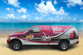
 It's time to pick a background image for our soon to be awesome gallery piece. Now prior to picking the image we can use our imagination to see where we would want this truck to be. How about at the beach?
Um, no. That won't work.. It's already a dark image (the truck) with no really strong light to match the beach scene. Let's keep looking...
I have used a Getty Images and Shutter Stock, which are fine stock photo depots, but we use Shutter stock at the shop so that is where I hunt for my pics when I need it. I found a suitable city scene that worked well with the truck considering the lighting on the truck and the perspective. It's usually a case of find elements that will do because there is much room for tweaking each element with Photoshop to reach the goal of tricking the eye. Here is the city scene; ready for a point of interest.
I don't know where this is, but it works...
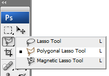
 One of the first steps in this adventure is cutting out the vehicle or object from the original background. In Photoshop there are a few ways to do it but the best way I have found is the Polygonal Lasso Tool. Because a vehicle has mostly straight lines, this tool works well to quickly follow the lines, create a selection area and remove background. You could use the magic wand as well if you have defined lines around your object.
Once your original background is removed from your object, it's time to see the light. Shadows, that is. To replicate the shadow underneath a vehicle consider studying what the real thing looks like. I found that there are two main parts to a shadow underneath a vehicle; a hard line and a soft haze that projects beyond the hard line. Do your own study and see for yourself how a shadow falls to understand this and therefore replicate. Here is my shadow without the vehicle done with brush tool with low flow, no hardness and a decent sized brush. The hard lines are made with a selection box and yet again the brush with the same settings.
Note: Just because we think a shadow is black, it doesn't always mean you use black. Sometimes the image contrast needs to be low. For instance when the image is historic or sepia, then your "black shadow" might actually be brown or even gray.
Normally I would create the shadow with the image of the vehicle in place already. So here is the pic of both the cut out vehicle and the shadow in the city scene.
Notice the truck window background was removed to show the rest of the scene. Just remember to say to yourself, " Self, what would I see here in real life". Always to good question to ask yourself most of the time, wouldn't you think so? Ha... ok maybe not. We are a weird bunch anyway so don't worry, you are in good company.
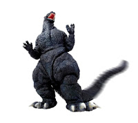
I added a FILTER/DISTORT/SPHERIZE to the city image after I added in my guest appearance by GODZILLA, complete with motion blur effect on the tale. Here is the old beast from a Google image search.

The color of the Zilla and perspective worked well with this scene. There are lots of possibilities for destruction, fire, jet fighters, helicopters, commandos, flesh wounds, dying pedestrians and other carnage, but alas, I had little time for this one! I will gladly give you the PSD for further enhancement.
So, to wrap this up I would like to present his scaliness taking a stroll through a very calm environment where pedestrians see monsters like this everyday. This truck alone stands to end the savage's abuse of the public transit thoroughfare.
Here is another before and after shot- The main trick in this was done with a layer style/color overlay to match the city image background. And don't forget all the other parts of what make this pic work mentioned above.
 |
| The original van pic on a dreary day. This is what most gallery pics look like. |
 |
| City scene from Shutter Stock |
 |
| The shadow with hard and soft line |
 |
| the cutout van over the shadow |
 |
| Whala! Ready for a magazine ad! Now I can imagine this with skid marks, wheel blur and smoke puffing out the back... |
Check out this example of Photoshop manipulation -
http://www.adobe.com/inspire/2013/02/interview-erik-johansson.html


No comments:
Post a Comment