Thursday, July 12, 2012

Tutorial on revamping BORING image galleries!

While flipping through my favorite magazines I have seen the best and worst cases of Photoshop trickery. I have more than often found myself saying, "Who let this ad get published?" or  "Bet this guy won't be designing there for long". Now, that's harsh, I know! I have also seen some great ads that have superior psd magic going on behind the scenes where all the elements come together make me say, ooooo, ahhhhh....

Some of my favorite are the Dodge Ram Truck ads last year that used an old type setting/offset theme. I can't find any examples, but if you are like me you have probably see them around.

This is a basic tutorial on how to take plain old image gallery pictures to another level and make them interesting. I had some down time and in a few hours boosted our vehicle wrap image gallery. There are plenty of mistakes and room for improvement, but I was limited with time. Case in point is ZR Graphics.com, which is the website for a large format printer in Zeeland Michigan who designs, prints and installs vehicle wraps on a variety vehicles.

This is not a full, step by step TUT, so sorry if it doesn't include every little step. This TUT assumes reader is familiar with Photoshop and it's abilities.

Our first pic here is the finished product. Neat huh?

Now lets begin with examples of each piece and build this beastly pic!

The most important factors of tricking the eye when it comes to Photoshopping an image are:

  • Perspective- how our eyes sees the world around us and the difference between objects in space and their relationship.
  • Color-  The colors of each element need to mimic what the eye would really see if this collage was in fact real. Save time by picking elements that share color and perspective if possible
  • Illusion of light- It's easy to overlook how light interacts with all the surfaces around us until you have to recreate a believable scene that copies what nature and the physics of light do everyday. Understanding shadows, reflections, light source will all play a part in this illusion.
  • Point of contact- This being the place where the elements touch, where edges are revealed. These are critical areas where all these elements come together. Some present more of a challenge than others.
We'll start with our virgin image, untouched, unmodified.

BORING!  We are located in West Michigan, so backdrops with beautiful mountains, beaches or canyons are not available. Don't get me wrong, this is beautiful place to live, but in no way will the boss let me drive around looking for a cool place to take a picture in front of!  So, we end up settling for our driveway with quaint homes in the background. Yes, something we probably all see everyday we drive to and from work or wherever your commute is.  This image will do, if I want to be like the rest of the galleries out there, but not for me, I want more.

It's time to pick a  background image for our soon to be awesome gallery piece. Now prior to picking the image we can use our imagination to see where we would want this truck to be. How about at the beach?

Um, no. That won't work.. It's already a dark image (the truck) with no really strong light to match the beach scene. Let's keep looking...

I have used a Getty Images and Shutter Stock, which are fine stock photo depots, but we use Shutter stock at the shop so that is where I hunt for my pics when I need it.  I found a suitable city scene that worked well with the truck considering the lighting on the truck and the perspective. It's usually a case of find elements that will do because there is much room for tweaking each element with Photoshop to reach the goal of tricking the eye.  Here is the city scene; ready for a point of interest.


I don't know where this is, but it works...

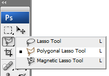
One of the first steps in this adventure is cutting out the vehicle or object from the original background. In Photoshop there are a few ways to do it but the best way I have found is the Polygonal Lasso Tool. Because a vehicle has mostly straight lines, this tool works well to quickly follow the lines, create a selection area and remove background. You could use the magic wand as well if you have defined lines around your object.

Once your original background is removed from your object, it's time to see the light. Shadows, that is. To replicate the shadow underneath a vehicle consider studying what the real thing looks like. I found that there are two main parts to a shadow underneath a vehicle; a hard line and a soft haze that projects beyond the hard line. Do your own study and see for yourself how a shadow falls to understand this and therefore replicate.  Here is my shadow without the vehicle done with brush tool with low flow, no hardness and a decent sized brush. The hard lines are made with a selection box and yet again the brush with the same settings.

Note: Just because we think a shadow is black, it doesn't always mean you use black. Sometimes the image contrast needs to be low. For instance when the image is historic or sepia, then your "black shadow" might actually be brown or even gray.


Normally I would create the shadow with the image of the vehicle in place already. So here is the pic of both the cut out vehicle and the shadow in the city scene.
Notice the truck window background was removed to show the rest of the scene.  Just remember to say to yourself, " Self, what would I see here in real life". Always to good question to ask yourself most of the time, wouldn't you think so? Ha... ok maybe not. We are a weird bunch anyway so don't worry, you are in good company.

I added a FILTER/DISTORT/SPHERIZE to the city image after I added in my guest appearance by GODZILLA, complete with motion blur effect on the tale. Here is the old beast from a Google image search.


The color of the Zilla and perspective worked well with this scene.  There are lots of possibilities for destruction, fire, jet fighters, helicopters, commandos, flesh wounds, dying pedestrians and other carnage, but alas, I had little time for this one! I will gladly give you the PSD for further enhancement.

So, to wrap this up I would like to present his scaliness taking a stroll through a very calm environment where pedestrians see monsters like this everyday. This truck alone stands to end the savage's abuse of the public transit thoroughfare.


Here is another before and after shot- The main trick in this was done with a layer style/color overlay to match the city image background. And don't forget all the other parts of what make this pic work mentioned above.
The original van pic on a dreary day. This is what most gallery pics look like.

City scene from Shutter Stock

The shadow with hard and soft line

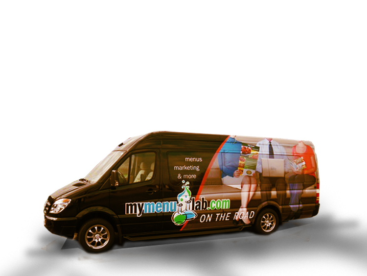
the cutout van over the shadow

Whala! Ready for a magazine ad!  Now I can imagine this with skid marks,  wheel blur and smoke  puffing out the back...


Check out this example of Photoshop manipulation -

http://www.adobe.com/inspire/2013/02/interview-erik-johansson.html

Wednesday, June 15, 2011

Here we go!

Since we moved to Michigan, I have let Inlan take a back seat while I got a steady job that could help us make a transition in this new stage of life.  I found a job at a local sign shop that came through for us.  I learned many things during my time there.  Almost made it a year there before it came to a crossroads. 

The entrepreneur in me has been itching to get back in the game and learn from my previous journey down self employment lane.  And so I have switch gears, currently working part time at another sign company where my hours are very flexible to help me achieve my current goal of getting Inlan operating on it's own to support our family.


Exciting.

I have had a lot of time to think about all the mistakes and failures during my first go at it and learned a great deal about good work flow and habits at my last place of employment.  My last position challenged me to be more organized and detail minded about customer orders. It pushed me in areas where I am weak and needed improvement on.

Here are a  few of the more recent sites that I have created since the last post!

www.therougesalon.com

www.adrianasboutique.com


www.jcronincom.com

I am highly motivated to do whatever I have to do to get Inlan going and have been enjoying getting back into working on my own and calling the shots. 

Thursday, July 8, 2010

How to start in web design or get your own website up quick!

Finding our way around this great area has been fun in the last two weeks since we moved here.  Even though I am here I am still working with clients in Florida.  I have been making every effort to finish up those projects and coming close to going live with both of them.  One being Laserpath in Oviedo, FL and the other being Paratour in Christmas, FL.  This is a sneak peak of the paratour site for now.  If you go to there site now you will see what I have been working from.  Man, tell you what, I am learning as I go here and site redesigns are certainly more work than starting from scratch.  Most of the work is restructuring  information and making sure the new site flows well, yes that would be UI.  I have been reading about another web designers strategies on Viget about processes that can help with PSD files that have alot of layers. Anyway, you pick and choose from all other until you find a way that works.

I am a novice coder with graphic design in my blood so working with code can be frustrating.  Fortunately I have found some tools that have helped me along the path of making some money selling websites without knowing all the ins and outs of HTML, CSS, PHP or JS languages.  I began with not knowing a thing or understanding how the web even works.  I didn't get online until around 2000. 

The First thing that helped was a community college class.
That was where all the lights turned on for me.  The Prof explained the basic elements of what it takes to get a site online and I was like,,,OH my gosh! that is so easy.  Here's the basics:

You have your computer that is online and there is another computer lets say in California, where it seems everything is going down.  The "server" is that other comp in LA that you pay to rent space on.  On your computer you create a file with the appendix like this .html  it looks like the other files that have other endings like .jpg or png. you follow?  This freaking thing is always putting my text in bold.. see.. I still have alot to learn and here I am trying to help you out! Stupid.. my dad says it's always the users fault.. so thanks dad..  HTML is a language like english that has to have things in a certain order for it to work.  Browsers like firefox and internet explorer (lame) read these languages and convert all that funky stuff into nice formatted legible things we read.  So you learn what makes a basic HTML file work.  You create it in a text editor, and every comp should have one of those, even PC's with windows (YUCK)... ok.. you can see that I don't like Internet Explorer of PCs that run windows or any microsoft makes besides Halo. and yes I have and love a Mac.

So you have a HTML file, then you send it to the server. HOw do you do that?  It's called FTP, File Transfer Protocol.  The first two words make sense and the last one just means the way something should be done to do what the word is referring to which would be the words around this protocol word.  So..  lets say you decide that after you saw a hot super bowl ad that you wanted to use Godaddy to do all that webstuff you've been wanting to do.  Well they make it pretty easy and that is where it began for me as well. I didn't see the ad, but I am sure it was a hard to ignore call to action.  So you set up your godaddy account and bla bla bla.. I can get all wrapped up in the details, lets keep it light so you can finish this up before your wife calls you up to move that heavy dinner table out of the basement before it gets ruined.


FTP, it allows you to send that HTML file to the server, remember, the other computer where that HTML file will now live in the rented space (hosting) that you bought  for $ 50-$90/yr. Now that file was called whatever you named it, mybologna.html or maybe  salami.html   whatever you called it, that name needs to change to this   index.html   . so either change it before you upload or after.  The server looks at the files you put on it and locates this file and makes it the "home page" of your website.  So, as godaddy offered you hosting which you bought , you probly bought a URL- Unique relative Location-  that is what thought that meant.. but it actually means Uniform Resource Locator
hmmm.  whatever.. let the computer engineers explain that one.   So that URL is your Address to the space you rented that will show whoever is visiting the HTML file you uploaded there.  Make sense... get the visual...    URL-address     HTML- lives on server   Index file- the new name of the HTML     FTP-how you got it there (the mailman, lets say)   Server- Rented space on that computer in California and BINGO you have a website!

Not so fast there Carlos!
Yes, there is alot more to it, but that will get you to make what all those geniuses writting books about how to do this, whats called a Hello world website.. your first WORLD WIDE WEB space.. wow.. now everyone can see you salami.html site that your just put up. 

I hope that wasn't to tangent full of rabbit trails.  Yes, I am certainly a creative and my writting goes all over.  The next cool thing that you can do is get photoshop and make your site even cooler.

Photoshop slices make a web pie
ok, this is old school, but you have to learn and start somewhere.  All the pros will tell you,  Ahhh. don't use this technique to make sites.. well tell em to get the silver spoon outta their A$$ and let you figure it out.  Yes.. there are standards when it comes to designing.  It isn't just for the sake of doing things just becuase, but there are easier and faster ways that you can learn to create sites, but it takes time to learn these jedi ways.  So.. on to photoshop and the lovely SAVE FOR WEB button.

Open up your new doc and make the settings RGB.. which stands for REAL GOAT BUTTER. and choose your dimensions.. then go to town.. paint a little here.. add a style to this layer.. and yes photoshop skills is for another day another time.  Just screw around and you'll make something cool eventually, it's digital so you won't hurt or make a mess of anything!  how cool is that.

Slice and dice the document with the slice tool... look for it by hovering your mouse over the buttons until you see the words SLICE TOOL.  this is goin to slice up your document so that it isn't one huge image when you do the next step.  This is where you would slice your navigation buttons up so you can create rollovers later on. For now just slice it up once or twice so you can see how it works.

Go to EDIT/SAVE FOR WEB.  a neat little window shows up maybe 4 windows is what you will see.  These are just different versions of your document at various quality levels.  It's like money, the higher the more quality.. I am talking about images now.. like lets say a picture off of your camera is 4mb (thats megabytes )..  thats pretty big.  the picture is probly 2000 pixels wide. (pixels is like inches, but smaller and is how we measure things that are digital) like my 13" screen is probly 1500 pixels wide or so.  anyway.. I always pick the 2nd box which is the highest quality besides the original.  look around and you'll see.  Than you can pick JPG or PNG-  the biggest difference is that PNG will save the images with transparency if you designed it that way and JPG won't.  Thats how you make your logo show up on your site with the background color of the site bedhind it.
Just pick one and save it.. remember to save all slices and pick a file.  now save.


DREAMWEAVER is part of equation
You will need DW to create a site this way.  it's not necessary, but it will help you take things further.
you could take your salami.HTML (photoshop created one for you with the save for web button) and all the image files (now all your slices are little jpgs or pngs and live in one folder called images) put both of those on your server and rename the HTML file to    index.html  and your site will work.

DW is a great help for those of us who learn by reverse engineering or trial by error, which is my preferred method.  Take a web class to learn about DW and how it can take your PSD (photoshop) file  (the sliced one )even further.   DW can make adding rollovers and hotspot links (where visitors can click and be directed somewhere else) and all kinds of things. 

Tables are good for eating on and learning web design

now your site is like a bunch of block put together to make one giant seamless block.  It is slower to build sites like this, but it will solve the problem of getting a site up and running without hiring a guy like me to make one for you.  I have found that the great divide is between design and coding.  there are great programmers out there, but they can't design worth anything, vice versa... like me.. no coding expert, but I can create a killer mock up.  The goal is to bring those two together and I am glad to be joining forces with Nathan shoultz in Upstate NY.  So maybe I can focus on doing what I know how to do and leave the other stuff to him.  Well I hope you learned something and don't commment  aboutb mdydy  writting,.. it's 1am and I am zonked..  peace.

Monday, February 22, 2010

No more signs...

thats the headlines on today's paper.  No more signs.  I am glad that I got a chance to run the sign business part of Inlan for 2 years now, but now it is time to move on.  I have been transitioning into web design for a little while now and trying to slowly close off the sign part of this company.  This year wasn't profitable when it came to signs and I had another little priority to tend to; my daughter.  She is now 13 months and growing so fast!  Man, she can really bring a smile to my face any day.  As of today I am working with WMtek in Vero Beach on a new CMS system called Site Stacker.  I am an independent reseller of this powerful software and will still be operating as Inlan.  Although I am considering a name change due to how signs dominated Inlan's business.  We'll see... It's a great tool for the end users as are the best CMS systems out there, but this one has made it incredibly easy for all users to navigate and update content themselves.  The interface is set up like a window's browser and allows a client to manage multiple sites via one window, allowing them to easily drag and drop content into a web site or even create a new page with the ease of just clicking the right thing.  It has a video manager, blog capabilities, form builder (highly intuitive and polished) and a WYSIWYG editor for editing site content like you would comfortably do in MS Word.   It allows me to still have creative control and even better than that it allows for super fast turnaround time.  Site stacker is created to perform and produce results better than any method I have had the opportunity to use; Joomla, static HTML...

I am looking forward to a bright future with this new alliance and hope to continue creating things and making a living doing it.  How cool.  Thanks Site Stacker!

Friday, November 20, 2009

BONKERZ sign going up today!

This is gonna be a fun one for sure.  I have some help today and thankfully, cause I up high and have to drill a bunch of holes in the wall to hang the new signs for the Bonkerz comedy club thats opening up soon in downtown DeLand.   It has been one of those projects that has taken some time to put together because of permitting and the restrictions on sign color and so on.  But, alas it is almost a done deal.  I am working with a company in Longwood called creative edge group which specializes in these type of signs.  Went by the shop today to pick up the sign and saw alot of cool stuff that I am going to be offering in our area.

Also, been working on the A list salon website and that is coming along nicely.  I am excited about going live with it soon.  These take some time to do right, for sure. I am certain Alissa will be pleased with the final product.  I love web design!  To create these beautiful full time representatives for local companies is certainly a satisfying job for me.   Well.. this is more like a tweet than a blog entry.   Come by and say hello to the new sign on the corner of  Church St and Woodland Blvd across the street from Firehouse Subs.

Oh.. and don't let me forget the most recent jobs Inlan has done...  

Just put up Laura's graphics on her new location downtown.  That turned out great.. The owner had a great idea of creating an "L" from all the various brands of clothing she buys and sells in her upscale consignment shop.  I put it together and it worked out to the store owners delight.  The cream looks good in the window instead of the standard white usually done on store front glass.

Also joining the happy customer club. ( boy, that would be funny if I had one of those...) is  Big Tree Yoga.  They opened shop up a few weeks ago where Nourish to Flourish was.  The owners brother created a great logo for them that I converted into cut vinyl for their store front glass.   They had tint on the glass so the white vinyl really pops out well.

Looking for business owners that are opening up shop in the old Curry the florist shop.  Dropped by there today.. nobody home..   Thats Inlan  for you. ..  knocking on doors and closing the deals!

Thursday, October 1, 2009

www.theinlan.com

Inlan Design is now on the web!  After two years of doing custom sign work for the Deland area, I am proud to announce our new web design services.  Getting a website can be a daunting task if you have no experience with the web or computers for that matter.  It can be a great tool that works like the best salesman you have ever had.  Think about it...  It's like having an employee that never sleeps, requires minimal oversight and can produce a giant boost in driving sales.

Not all web sites are created equally, so just because you might have a web site doesn't mean it will actually produce good leads and do it's job.  It isn't necessary to spend thousands either to have a useful site.  In between the economy priced, vanilla boring web sites and premium, flash induced, cost a whole lot site exists the great web site that doesn't break the bank, looks professional and keeps the register ringing.  This is where we exist.  IF you want that vanilla template based  website we won't do it!  Its part of my own standards that whatever we produce must be on par with the designs and layout of the best in the industry or as close as possible given your ideal budget.

Many people forego the idea of a website thinking that it isn't necessary.  I can hear some of them say," We've been fine without one, so why spend that money?".  True, you have been fine without one, but that isn't the point.  What could your business be with a proper presence on the web?  Do you know that the market is more and more becoming online based?  So many people buying and selling online.  So many people searching for that one particular thing, ready to buy it once it's found.  Is there a demand for what your products or services online?  All it takes is being there when someone searches and providing them with the right information and possible persuasion so they can act.

So, welcome to the new possibilities and potential your business could have.

www.theinlan.com